I have been called independent by everyone who knows me. Sometimes it’s to the point of insult. While I don’t think all the blame lays solely on me (Ne-Yo was integral to my childhood), I can admit my DIY spirit does-occasionally- get a little out of hand. This week falls under that, but to be fair each of these projects has been a long time coming.
That’s because my second undeniable character trait is procrastination.
Monitor Mounting
When I upgraded my computer back in 2020, I also upgraded my monitor. my current one was perfectly fine, so I still use it, it was just downgraded to the side. After that, I decided to invest in a display tablet in the hopes it would get me to make art again (this did not work).
To make matters worse, my poor IKEA tabletops are not exactly rated for the weight I put on them. I absolutely couldn’t fit my tablet on the same table as the main screen and had to work on a constant swivel if I wanted to see my references while drawing. Having three monitors on concurrently was never the plan, as the secondary monitor is used for discord while I’m full screen gaming. But I didn’t want to have to go to the trouble of redoing my entire setup when I wanted to switch from gaming to art.
Enter the monitor and computer mount (not shown). A solid two hours of careful measuring and fretting over trying to find the stud in my horrifically textured walls yielded some pretty great results. For one, the weight on my poor IKEA table is reduced significantly. I can also now adjust my main screen to my actual eye height, which most stationary desk stands don’t do. The screen already feels brighter and more clear just by being in front of my eyes and not below my nose.

I couldn’t wait to try out the setup.
The biggest win is that now I can simply press a switch to change secondary monitors, and reference without having to spin around. This is especially important for streaming as well.
It took me two years and my total costs came to around $100, but I really should have done this sooner.
Project Planning
I don’t think this counts as DIY, but it did scratch the same itch. I’ve been using Notion for years to innocuously gather links to clothes I want and maps of places I want to run locally. Not exactly the best use of a project-planning software, but I hadn’t reached the point of necessity…Until this week.
As I mentioned in my previous post, I intend to start streaming on Twitch in late October/early November. I also can’t settle down and use a pre-made overlay set. My aggressively independent nature says that I must make all the assets myself.
I haven’t set myself up for too much work (this is an example of hubris), but it’s enough that I have to keep on top of things, or I’ll forget something important and be really inconvenienced when Halloween rolls around.
Notion has a lovely lightweight Gantt chart engine that can be made from a simple database. It’s a great way to see how my week should be going.

The status view is a little cluttered but quite helpful
For now I only plan to use this for Twitch workflows until I get my comic and illustration workflows standardized, but it’s been quite soothing to see everything laid out so clearly.
Feeling Fontastic
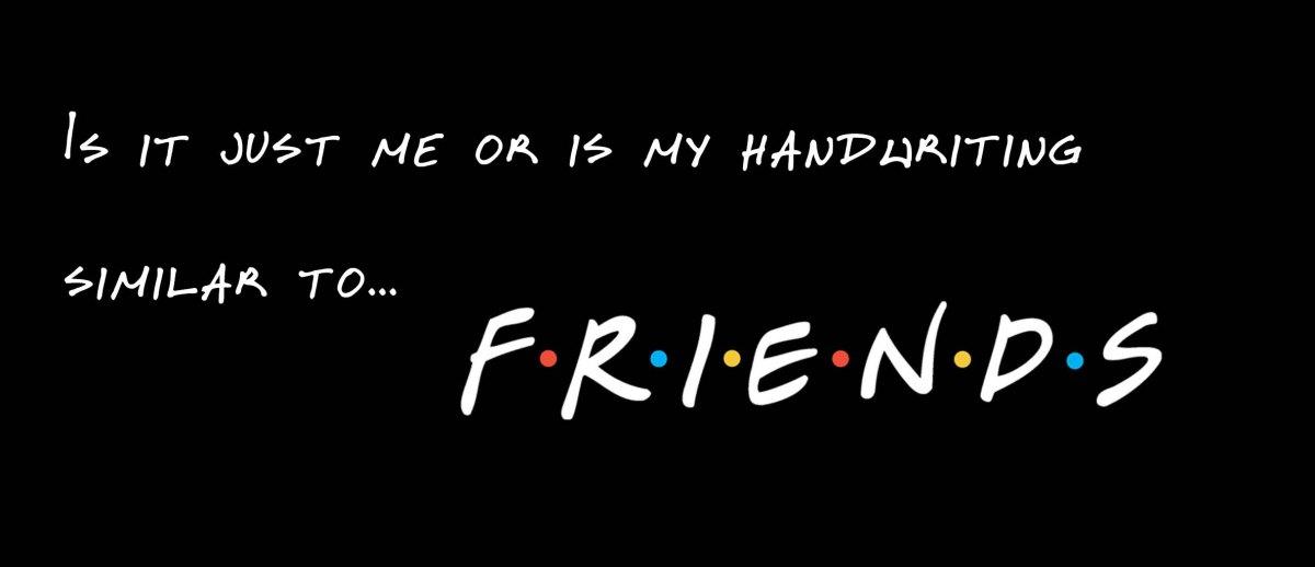
Did you notice the one completed task on the timeline above? That’s right. Here lies the culmination of my DIY delerium: my own fonts!

Making these is somewhat addictive.
I’ve intended to make my own font since my first doomed attempt at creating ID. I was happy with the pages all the way until I began lettering digitally.
It’s legible but it isn’t right.
There were other things that I disliked as well about the digital process, but this was one of the biggest. At the same time, hand-lettering is an art all its own. Doing it by hand adds another hour per page at least. It’s not an efficient use of time, especially in a comic as detail and asset heavy as ID. I don’t feel guilty about streamlining it either. Pro comic artists who still work traditionally-both eastern and western style with their own unique professional workflows- rarely handle lettering by hand on their own.
I’ve got a lot of ideas and uses for my various handwritings, so there will likely be more cr0wfonts in the near future. For now I’m limiting myself to these four. These are made using the free version of Calligraphr, which limits the fonts made to just 75 characters. This is fine for my immediate needs, but it doesn’t cover all punctuation. I’m currently debating whether I will shell out for a month and make a huge selection, or if I’ll buckle up and use Inkscape to create my own from scratch.
These serve my immediate needs well, and now that they’re out of the way I can concentrate on other parts of this really fun Twitch prep project. I must advise anyone looking to create a font on their own to proceed with caution however. Too much knowledge can be…uncomfortable

Not similar enough to get sued but…
fatcr0w is a hobbyist artist with a passion for comics and illustration. They take on too many projects and don’t know when to shut up. It is with great optimism that they believe one day this blurb will be more interesting.
